


When creating a website I make sure the design works across every screen, from different sized monitors and laptops to tablets and mobiles. By installing specific breakpoints your site will always look at its best.
Build my website Next ⟶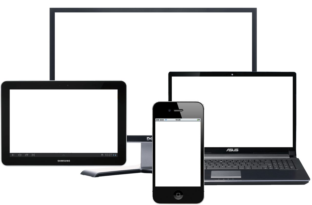

A dynamic website that doesn't feel static and will draw viewers in. If you can imagine it, I can build it. This will be responsive across all devices.

Pick up the phone day or night and I will be there for all your website needs. You'll never have a problem trying to get in touch.

There are design choices to made for every field, different colours, fonts, shapes, images, layouts, the list is endless. I'll research your profession to find the latest trends and give your site that competitive edge.

Ranking high in Google search results is not a fast or easy process, it takes time. I'll be putting that time in for you to make sure your website has all the necessary tools to work its way up the ladder in Googles search algorithm.

Your website will continue to get the attention it needs beyond deployment to stay up to date and relevant. Whether you want something changed 1 week or 1 year after creation, I'll be there to do it.

The only person you'll ever have to speak to for your web hosting needs is me. Not only will you have peace of mind of a solid hosting plan but you can also rest easy knowing I'll make regular backups of your site, along with keeping your details up to date.
You can reach me at +44 7423718481 or email me at develop@pauledward.dev. Alternatively fill out the form below and I'll get back to you.